

BRAND
PROJECT
Design & research for GOAT’s exclusive site, app and social experiences
GOAT prides themselves on being trendsetters when it comes to the fashion apparel industry. This project aims at delivering that luxury
SUMMARY
RESPONSIBILITIES
UX Research
UX/UI Design
Wireframing
Prototyping
FOR A BIT OF CONTEXT
Sneakers are one of the few marketplace items that tend to increase in Gross Merchandise Value (GMV) over time — and GOAT launched the year that the Yeezy line launched. So the fact that they were going to sell sneakers valued at over $600 for the original retail price of $200? That was a big deal in the sneakerhead community, even though the co-founders didn’t quite realize it at the time.
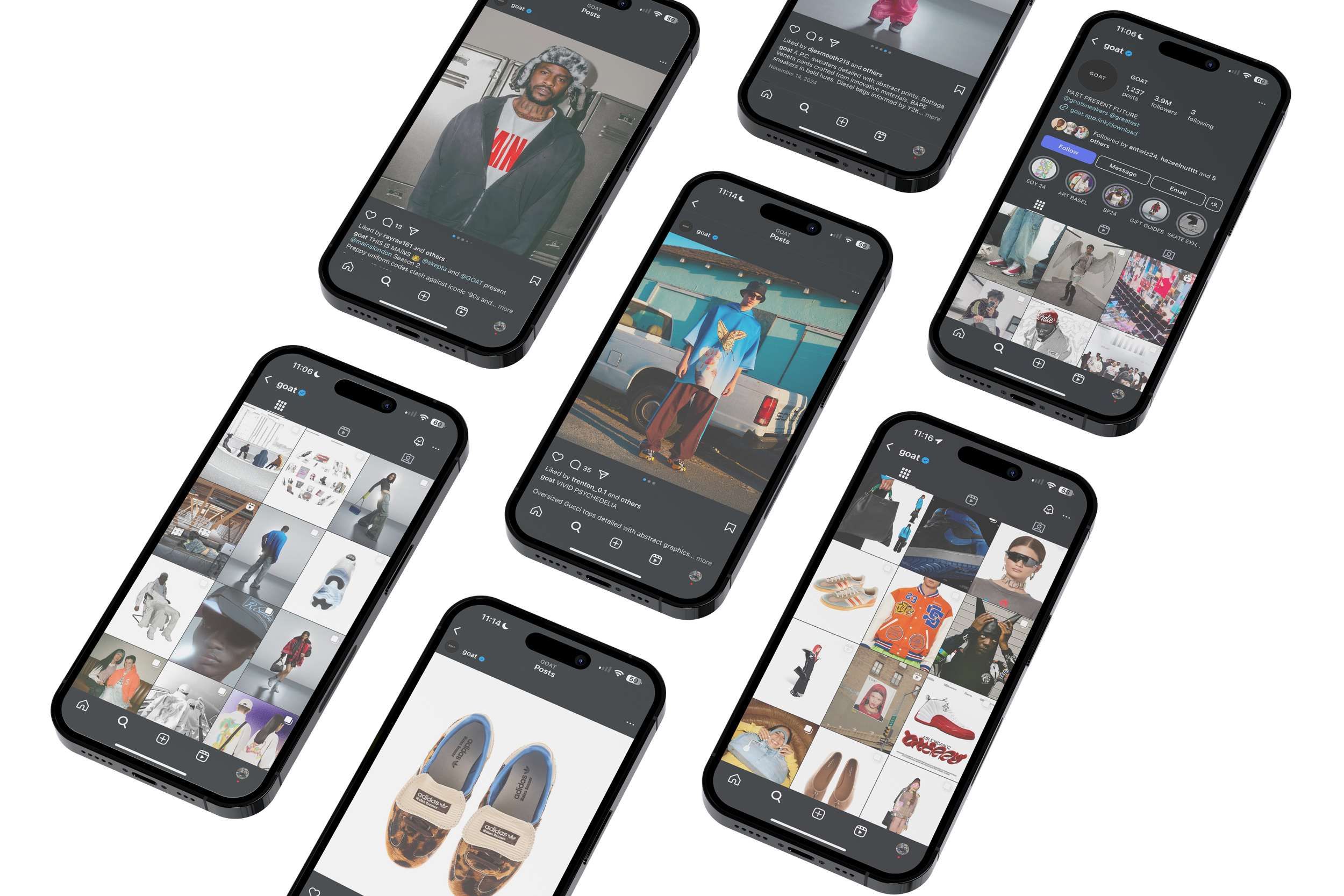
While the initial app focused only on footwear, in 2019 the founders began expressing interest in expanding into new markets and offering luxury, streetwear and accessories. Based on extensive research and feedback, the need for new site implementation and social outreach campaigns became obvious
KICKING OFF
-
GOAT was primarily launched as an app first, with the founders focusing on creating a mobile platform for buying and selling sneakers with authentication features, rather than a standalone website at the start; the concept originated from the idea of providing a reliable way to purchase sneakers online due to the prevalence of counterfeit products, and the app was designed to address this issue.
GOALS
Business: Increase the number of members, both sellers and buyers, by way of offering a dynamic platforms (specifically a .com site + social media presence) that enhances the messaging + traffic and emphasizes GOAT’s exclusive brand identities (for products and GOAT alike). Enhance GOAT’s ship-to-verify model that uses machine learning and human review to verify the authenticity of the sneakers on its platform.
Users: The current target audience are folks primarily fashion collectors between the ages of 18–45 that live in larger cities, interested in exclusive offers, collectors items focused on authenticity and condition
current pain points
Since the original experience was unintentionally minimal in it’s presence + offerings, expansion was necessary to solve user + business goals. Order glitches, unresponsive design and confusing navigation on the existing platforms were reported along with overall lack of brand visibility + exclusivity of products on social media.
PLAN OF ACTION
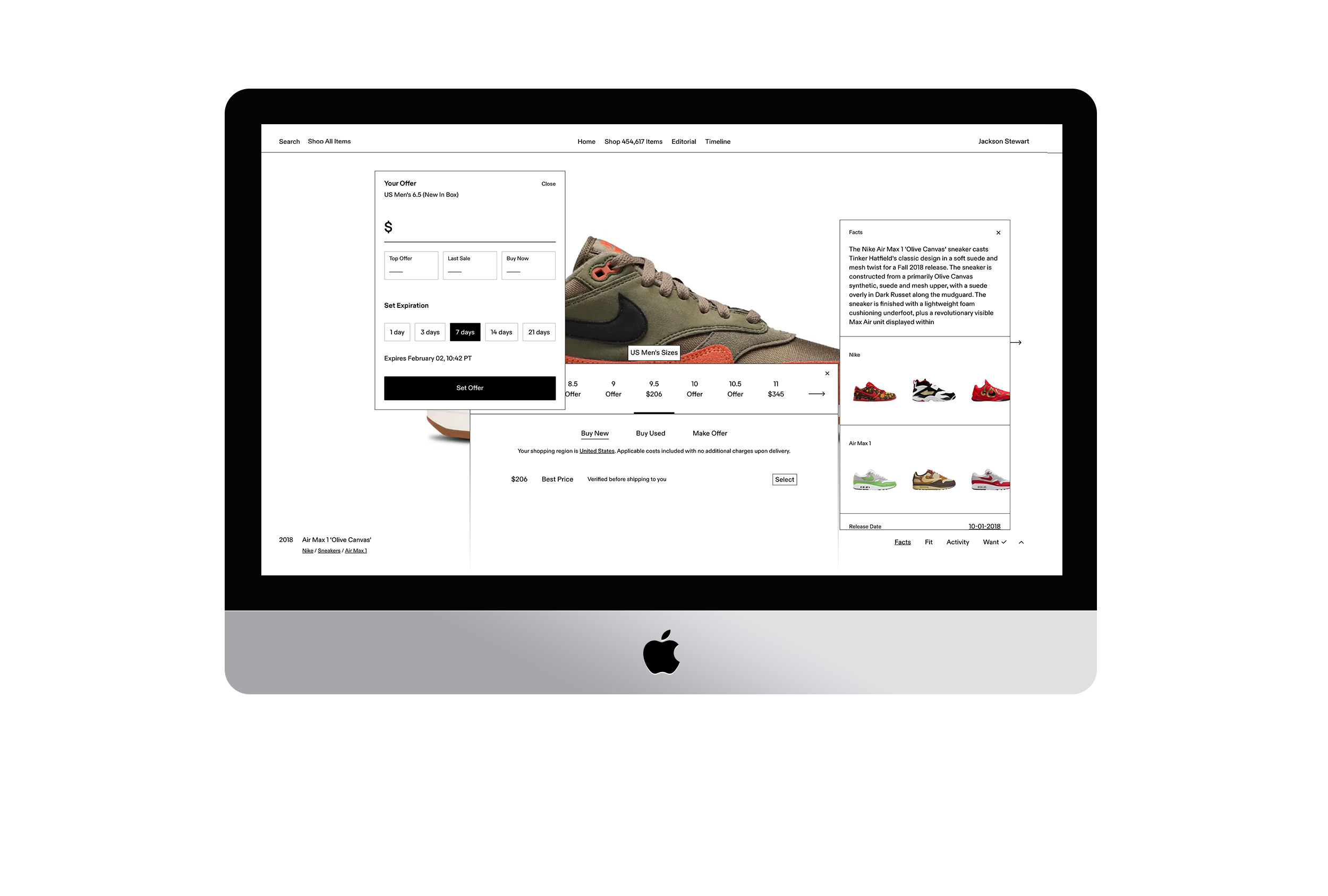
Create a modern, multi-informational and interactive site experience that emphasizes and heightens transparency + brand exclusivity
Iterations & future design produced great results:
IMPACT
Increase in monthly organic search traffic in 6 month period
1554%
More users since launching the app only
80x
66%
Increase in newsletter sign up conversion rate
New members that have joined the community
30 million
1+ million
New sellers for all item types across the website
Global locations that have joined since the .com launch
170+
UNDERSTANDING THE PROBLEM VIA EXPERIENCE MAPPING
The first step was to get acquainted with the vision for the product – by looking at the data and user feedback.

DESIGNING THE MVP & PLANNING THE STRUCTURE
A straight forward e-commerce site isn’t complex by nature, especially anymore. But translating a small but growing platform from an app to maintain a new and complex system in site format can be prove to be tricky, and for that reason, getting alignment before starting any design work was crucial. And that’s why we turned to user feedbackTo tackle this complexity, we decided to focus on the extensive product information and unique timeline experience, allowing the layout and overall layout to be a bit more minimalistic with vibrant supportive imagery.

Flowchart
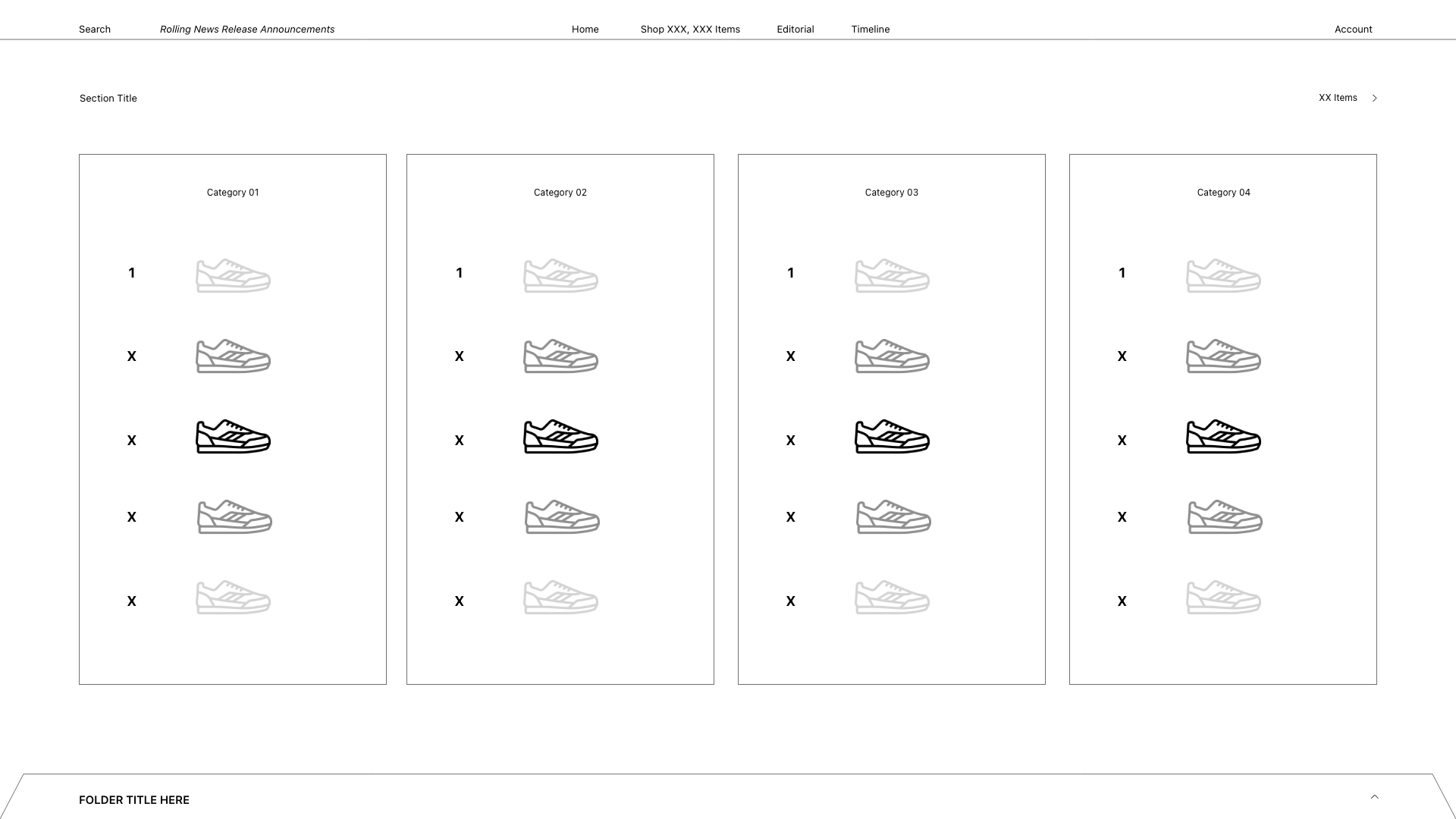
wireframing
Once we had a structure in place, we moved onto wireframes where we explored how each screen would be laid out. This allowed us to quickly sketch out different user flows without having to spend too much time thinking about visual design of those screens.
The main focus during the initial stages was on onboarding and the Ceremony builder, the main tool in the Provenance wedding app, made to help you write your ceremony script. This laid the foundation for further expansion and paved the way for introduction of additional tools.


Wireframes

Following the completion of the wireframes, it was time to translate them into UI designs that would be handed over to the developers for implementation. This included defining the site’s visual identity that aligns with the brand guidelines, while also following UI best practices, with accessibility needs at the forefront.
UI FINAL DEVELOPMENT

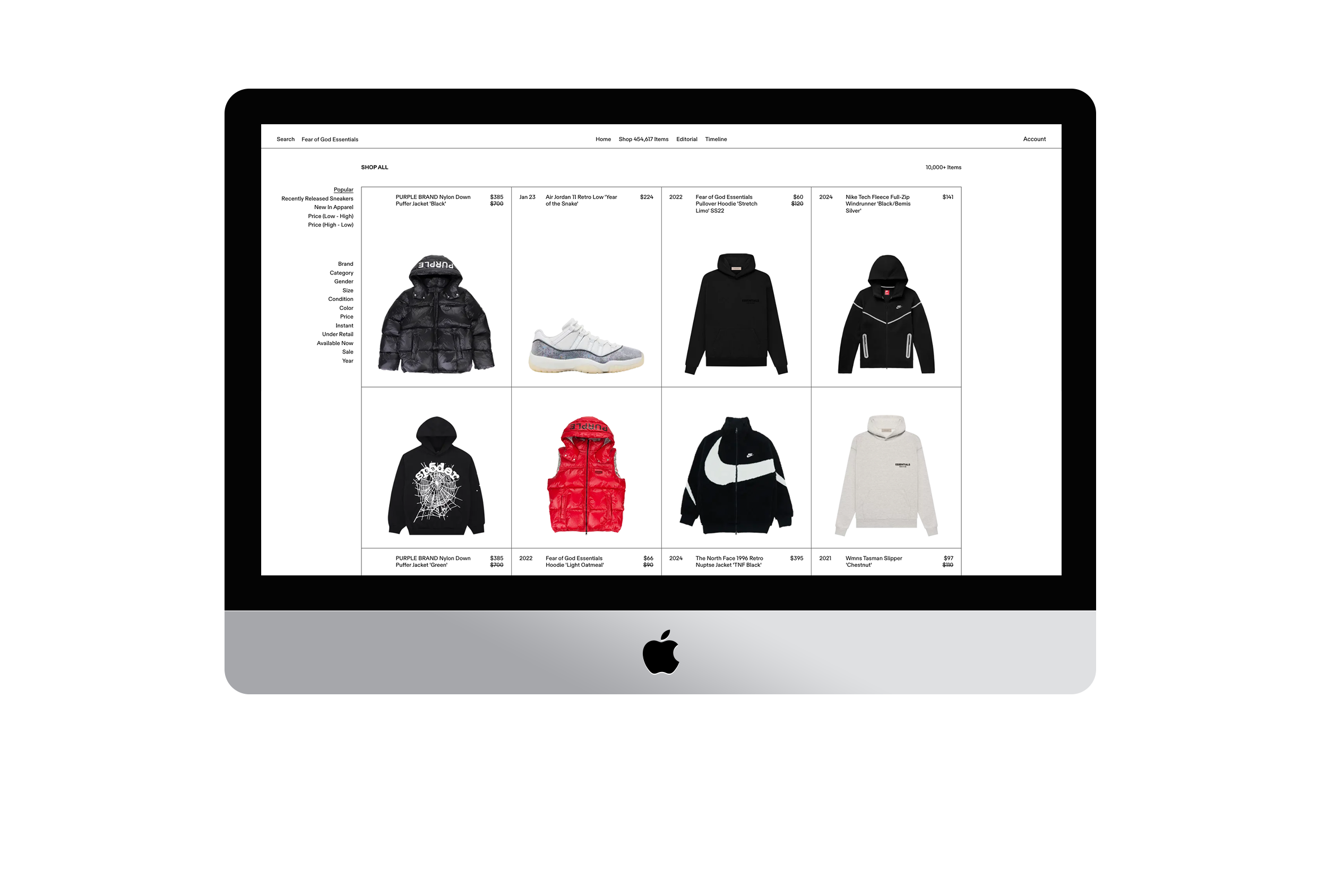
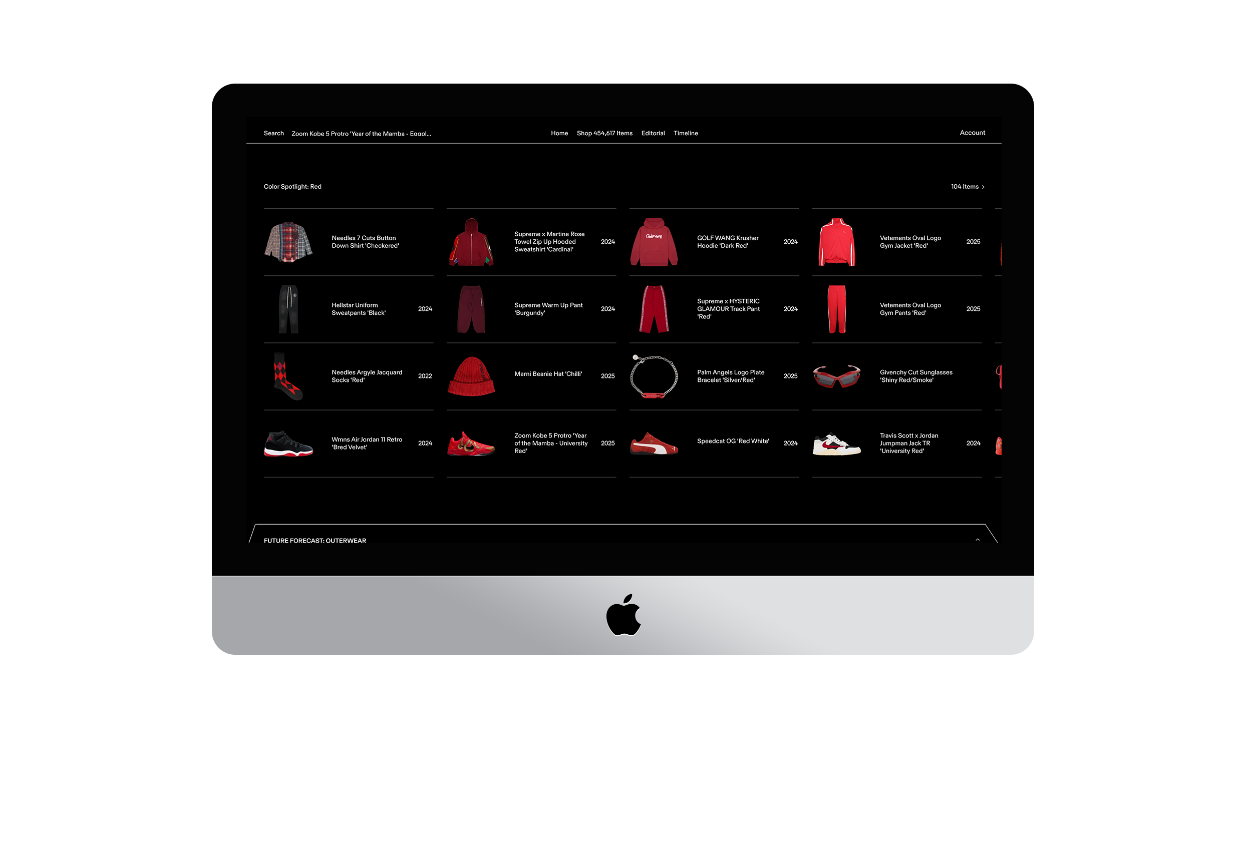


Interface